Drivers
A driver is a widget that writes a value.
Where a pose layer says "at this position, expose frame 861", a driver says "set this node's OPACITY to 43.7", or "swap this drawing", or "disable this node".
Add one with + → Driver in the Outliner. It is created and routed straight into its editor — there is no dialog.
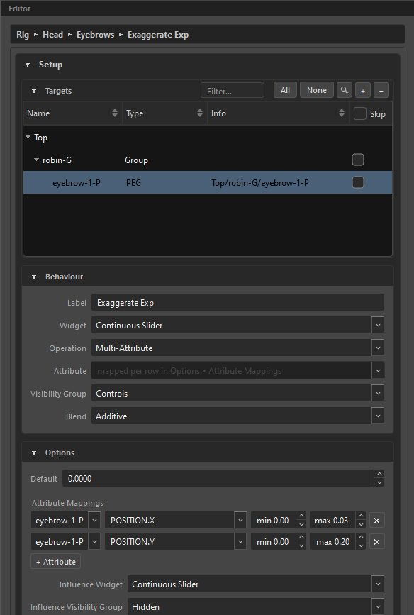
The editor is two sections: Setup (what it drives and how) over Values (the knob you actually turn).
The four kinds
| Kind | Widget | Try it |
|---|---|---|
| Checkbox | Two states | |
| Combo Slider | N discrete options | |
| Continuous Slider | A range | |
| Continuous Grid | A 2-D pad |
A driver pad is always continuous — a discrete 2-D thing is a pose layer, not a driver.
Changing the kind rebuilds the Values knob live, and any attribute the new kind cannot drive is dropped rather than silently kept.
Setup
Targets
The nodes this driver writes to. + offers:
| Entry | Adds |
|---|---|
Add from Node View |
Whatever is selected in Harmony |
Look-At ▸ |
A look-at field — the driver takes over that field's value |
Driver ▸ |
Another driver — this one drives that one |
Constraint ▸ |
A constraint — this driver gates it on and off |
The list is hybrid: Harmony nodes and internal targets live side by side.
Same kind only
A driver can only drive another driver, or a look-at field, of its own kind. A checkbox drives checkboxes, a slider drives sliders. The reason is concrete: a checkbox writing 0/1 into a slider pins it to two values, and a slider writing 37.5 into a checkbox is read as "on".
When nothing qualifies, the submenu is disabled and says so: "No other Slider driver to be driven by — a driver can only drive one of the same kind."
Only a Checkbox driver may gate a constraint, because a constraint is on or off.
Behaviour
| Field | What it does |
|---|---|
Label |
The name the animator sees on the widget. |
Widget |
Checkbox / Combo Slider / Continuous Slider / Continuous Grid. |
Operation |
What the value does — see below. |
Attribute |
Which Harmony attribute to write. The list is filtered to attributes this widget kind can actually drive. |
Visibility Group |
Where the widget lives. |
Blend |
Only appears when a target overlaps another author. |
Operations, by kind:
| Kind | Operations |
|---|---|
| Checkbox | Toggle Attribute, Enable / Disable Node, Show / Hide Node Controls, Show / Hide Deformers |
| Slider | Set Value, Multi-Attribute |
| Combo | Set Value, Multi-Attribute, Drawing Substitution |
| 2-D pad | Set Value, Multi-Attribute |
Under Multi-Attribute the Attribute field is disabled and reads "mapped per row in Options ▸ Attribute Mappings" — each row gets its own attribute there.
Greyed, never hidden
When a widget kind is unavailable, ORC greys it and puts the way out in the tooltip — for example "This driver drives «Blink», which is a Checkbox — remove that target from the Targets list to change type." You are never left guessing why an option will not take.
Options
What appears here depends on the kind and operation.
Handle Min / Handle Max — the numeric range the handle maps to, default 0–100. Default — where it starts.
Under Multi-Attribute the min/max disappear: the handle is a percentage, and each mapping row carries its own range.
X Min / X Max / Y Min / Y Max, plus Default X / Default Y. Default span is 0–1 on both axes.
+ Option adds an entry. What an option contains follows the operation:
| Operation | An option is |
|---|---|
Set Value |
A label and one number |
Multi-Attribute |
A card holding several attribute rows and/or drawing swaps |
Drawing Substitution |
One drawing per READ target, mirrored automatically |
Default picks which option the rig starts on.
With zero options the Values knob is disabled and says: "This knob has no options yet. Add them in Setup ▸ Options to make it usable."
For a slider or pad under Multi-Attribute. Each row is a node, an attribute, a min, a max, and — for a pad — which axis drives it. The driver's 0–100 % is remapped into each row's own range.
Influence
Every driver can carry an influence: a second widget, 0 to 1, that decides how much this driver is allowed to do.
| Field | Meaning |
|---|---|
Influence Widget |
Slider (anywhere between) or Checkbox (all or nothing) |
Influence Visibility Group |
Where the widget lives — Hidden conceals it |
Influence Default |
The strength the rig is born with — 100% is full drive, the neutral |
The default is set with the same widgets the rest of ORC uses — the nav slider with its anchors and arrows as a percent scale, or a checkbox when the influence itself is one.
In the Widget Editor the influence is a widget like any other: always listed (greyed while Hidden, like everything hidden), with its own Visibility Group editable right there, its own Label field (default <driver> - Influence, shared with the composed rig) and a glyph that follows its slider / checkbox type.
Hidden conceals the widget; the default still applies. A driver whose influence sits in Hidden at the 100% neutral simply drives — nothing extra exists in the rig. But set the default to, say, 50% and hide it, and you have hard-wired "this master drives at half, always" without giving the animator a slider: the value lives on as an attribute in the composed MC's Layer Properties, reachable there and nowhere else — the same treatment the Interpolation toggle gets.
What influence means depends on what is being driven:
| Driving | At influence 0 |
|---|---|
| A numeric attribute | The value returns to what it was before this driver — a straight blend |
| A toggle | The driver does nothing (below 0.5 it is simply skipped; a half-enabled node has no honest meaning) |
| Another widget, or a look-at field | The driver releases it — the target answers to its own control again |
That last one is the one to remember: influence on a driver-to-driver link is release/hold, not a blend.
Scope
| Field | What it picks |
|---|---|
Control |
Which control owns this driver — or Globals |
Keyed across |
Global, Control, Pose Layer, or Control + Pose Layer |
Pose Layer |
Which layer, for the layer scopes, plus Use pose layer knob |
Side |
Which page side, when the layer has more than one page |
This is the driver's key domain — it decides whether the driver holds one value everywhere or one value per snap.
A checkbox driver is Global only
Everything else greys out with the reason. If you need a per-snap on/off, use a Combo Slider with two options.
Values
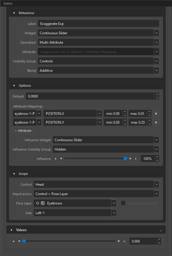
The knob itself, plus a small ● auto-key dot in the section header — green when on.
Sliders and combos come with nav chrome: ◀ / ▶ step one tick, and the two end anchors — start and end — jump to either extreme.
Changed values go yellow after a re-open
On a rig re-opened from a composed MC, a driver value changed at a snap marks that snap yellow on the driver's navigators — layer grid, slider tick head, knob card — and on the control snap above it. Re-keying the same value marks nothing: yellow reports what is different, not where your cursor has been. See Visual Indicators.
Keying a driver
Hover the knob and press F6, or right-click it:
| Item | Notes |
|---|---|
Set Key F6 |
Disabled at Global scope, with the reason |
Remove Key F7 |
Disabled when there is no key here |
Set as Default |
|
Reset to Default |
|
Driven by ▸ |
Which driver drives this one |
At Global scope the keying items explain themselves:
This driver's Scope is Global, so it holds one value everywhere. Set Scope to a control grid in Setup to key per snap.
Colours
| Colour | Meaning |
|---|---|
| Green | Keyed at this snap |
| Red | Interpolated — blended from neighbouring keys |
| Pink | Driven by another driver |
Keyed green wins over driven pink, and when you remove the key the pink returns underneath. A driven knob stays interactive — you can push it to preview, and compose overwrites it from its source.
Additive drivers
A driver whose blend is Additive writes on top of what another author already produced. Its keys are deltas, not absolutes, and zero means no change. The Outliner marks it with a Σ.
The blend defaults follow the scope — global drivers add, per-snap drivers override — and the row only appears when a target genuinely overlaps another author.
Additive is applied only to targets that actually overlap. A sole-authored node has no base to add onto, and adding onto your own previous write is how a value runs away.
Muting
Right-click a driver in the Outliner and choose Mute: "Skip this driver at compose without deleting it (dimmed in the outliner)."
The row dims, the driver stays in the rig, and Compose ignores it. It is the way to test a rig without one driver in it.
What a driver becomes
At Compose each driver turns into a widget on the canvas plus a function that runs whenever it moves and once per rig update. It carries its own attributes on the MC node, so an animator can key it on the timeline like any other Harmony attribute.
Related
- Dimensions & Key Domains — what Scope means
- Constraints — what a checkbox driver can gate
- Look-At — whose fields a driver can take over
- Visibility Groups — where the widget lives
- Widget Editor — where you place it