Widget Editor
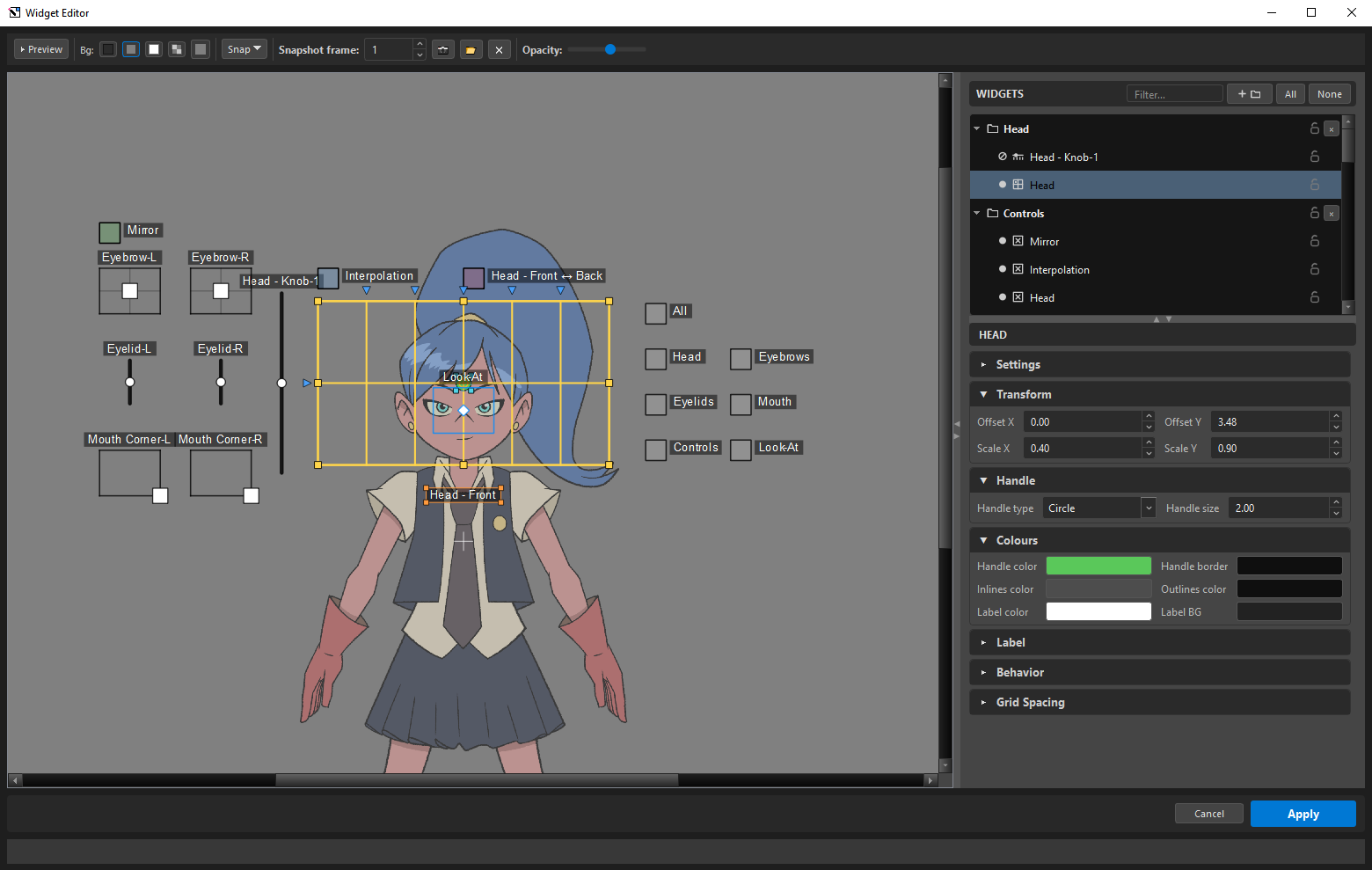
The Widget Editor is where you lay the Master Controller's widgets over your character: position, scale, handle shape, colour, labels.
It renders every widget exactly as Harmony draws it — transparent body, black border, white handle, label on a dark chip. What you arrange here is what the animator gets.
It authors appearance and layout only. Posing stays in ORC.
Two ways to open it
| Opened from | What it is |
|---|---|
| Inside ORC | The  Widgets button in the top bar — the same icon either way. It shares ORC's undo history — one document, one history. Widgets button in the top bar — the same icon either way. It shares ORC's undo history — one document, one history. |
| Standalone | The same icon in Harmony's Octo Tools toolbar, beside ORC's — or Octo_WidgetEditor() from a script. It opens without ORC, loads the MC selected in the Node View, and can restyle an MC that is already composed — or a plain Toon Boom one. |
Inside ORC, the editor locks ORC's window behind it — see why — but never blocks Harmony, so you can still pick nodes in the Node View while it is open. Standalone there is no ORC window to lock: the editor and Harmony are all there is.
The toolbar

MC slot (standalone only)
MC: shows what is loaded. Set loads the Master Controller selected in the Node View; ✕ clears it.
Preview
▶ Preview toggles between Layout mode (arrange things) and Preview mode (test them) — the button, or just Tab. In Preview, dragging a widget actually drives the rig, and visibility-group checkboxes really hide things — it is the rig behaving, before you compose.
Leaving Preview restores everything, so the Harmony scene is never left mutated.
Background
Four swatches, plus a custom colour picker:
The canvas flips its own line colour automatically: on a light background the grid and camera frame are drawn dark instead of white.
Snap
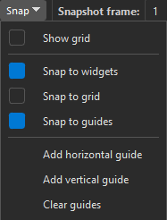
| Item | Default | What it does |
|---|---|---|
Show grid |
Off | Draws the animation field chart — the classic N/S/E/W numbered chart, which is what "Snap to grid" aligns to |
Snap to widgets |
On | Photoshop-style alignment between widgets |
Snap to grid |
Off | Snaps by widget centre |
Snap to guides |
On | Snaps to your own guides |
Add horizontal guide / Add vertical guide |
Adds a cyan guide at the origin | |
Clear guides |
Removes them all |
Drag a guide off the canvas to delete it. Guides are saved with the rig, so they travel in presets.
Snapping shows a pink hint line while it is holding.
Snapshot
Put your character behind the widgets so you can place them against the actual art.
| Button | What it does |
|---|---|
| 📷 | Render the character at the given frame as a backdrop |
| 📂 | Load an image file instead |
| ✕ | Clear it |
Opacity fades it, default 55 %.
If the render comes back empty, the status line says why instead of failing silently: a scene (or a .tpl opened directly) with no Display node has nothing for the renderer to reach — add one, or import the template into a scene — and with no Harmony session there is nothing to render from. Load… works either way.
The backdrop cannot be moved or scaled — on purpose
It is locked onto the camera frame so it stays a 1:1 reference. If it could drift, it would stop being one. Only opacity is adjustable.
⚙ and ? (standalone only)
Preferences and Help. The embedded editor does not repeat them — those are ORC's, one window up, and two gears in one window would read as two settings stores.
The canvas
Moving around
| Gesture | Effect |
|---|---|
| Wheel | Zoom toward the cursor |
| 2 / 1 | Zoom in / out (Toon Boom's own bindings) |
| Ctrl+= / Ctrl+- | Zoom in / out (rebindable) |
| Hold Space and drag | Pan |
| Shift+M | Reset the view |
The camera frame is drawn as a rectangle around the origin, with a small crosshair at 0,0.
Selecting
| Gesture | Effect |
|---|---|
| Click a widget | Select it — and its twin, for a linked L/R pair, since the pair acts as one |
| Ctrl+click | Toggle one item, without pulling in its twin |
| Shift+click | Add to the selection |
| Marquee from empty space | Select everything the band actually touches |
| Ctrl+A / Ctrl+Shift+A | Select all / clear |
With several selected, drag any of them to move the group — and the inspector becomes a batch editor: it shows the appearance fields the selection has in common, and editing one writes it to every selected widget, even where their current values differ. Mirror-only entries are skipped (edit their L twins), and in Preview mode only the Visibility Layer is offered.
Moving and scaling
| Gesture | Effect |
|---|---|
| Drag the body | Move |
| Arrows | Nudge |
| Shift+arrows | Fine nudge |
| Hold Shift while dragging | Axis lock |
| Middle-drag | Move the whole selection from anywhere |
Selecting a grid gives you a box gizmo with eight yellow handles, plus an orange pivot ring you can move — Alt scales symmetrically about it, Shift locks the aspect. A slider only offers its long-axis handles, because scaling its thickness would mean nothing.
Slider orientation, and reading it
A slider's authoring axis and its display are separate things. The layer authors a list of positions; here you decide whether that list is drawn horizontally or vertically, and which way round it runs.
That freedom creates a question — which end is state 1? — and the two end anchors answer it:
| Glyph | Marks |
|---|---|
| The start of the travel — state 1 | |
| The end — the last state |
Rotate the slider, reverse it, and the anchors follow: the square is always where the count begins. They are the reason a reversed vertical slider is still readable at a glance, here and in ORC's navigator.
The handle glyph has its own small cyan gizmo, so you can size the thing the animator grabs independently of the box it moves in.
Shaping the lattice
Select a grid and it turns yellow — the editor's "this is what you are shaping" colour — and small blue triangles appear just outside the box, one per inner line, each pointing into the grid: ▼ above a column, ▶ beside a row. Drag one to move that line — this is how you make a lattice that matches the character rather than a uniform mesh, and how a row or column gets its own width or height.
| Modifier | Effect |
|---|---|
| Shift | Fine — quarter speed |
| Ctrl | Snap to 20 logical stops across the span |
| Alt | Symmetric — the mirrored line moves with it |
The four edges are the grid border and never move, and an inner line clamps between its neighbours. While you drag, a small pill shows the gap to each neighbour right on the canvas — with Ctrl's snapping you can read the exact increments as they land, and with Alt the mirrored line shows its own pair, which is how a left/right spacing inconsistency gets spotted. The same values appear as spin boxes in the inspector's Grid Spacing card, and a canvas drag pushes back into them.
The L/R gap
A selected linked pair shows a red bracket between its two grids — visually distinct from the blue line grips on purpose. Dragging it changes the gap symmetrically while keeping the pair centred. Shift is fine; the minimum gap is 0.05.
The Widgets panel
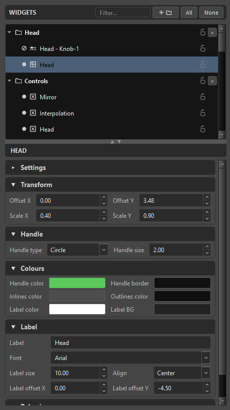
The tree on the right lists every widget, in folders you can make yourself. They organise the editor, and any folder can be dragged — but they are not throwaway: the folder tree is saved with the rig, composes into the MC, and greets you again when the standalone editor opens that composed MC. The standalone can move what it finds; only creating new folders is an authoring-time thing.
Each row carries a lock: a locked widget still paints but cannot be selected or dragged, and clicks pass through it. Use it to pin down a finished section while you work around it.
A widget whose visibility group is Hidden is listed but not drawn: "Drag it out of Hidden to bring it back."
Below the tree, the inspector shows the selected widget's properties, grouped into cards:
| Card | Holds |
|---|---|
| Settings | Per-kind options |
| Transform | Offset X/Y and Scale X/Y |
| Handle | Handle type — Circle, Square, Diamond, Triangle — and its size |
| Colours | Handle, handle border, inlines, outlines, label, label background |
| Label | Text, font, size, alignment, offset |
| Behavior | Visibility group and per-kind behaviour |
| Grid Spacing | The inner row/column positions, collapsed by default |
T cycles the selected grid's handle shape.
Inlines need outlines
Show inlines is disabled unless Show outlines is on: "Inner grid lines need the outer border. Turn Show outlines on to enable this." Toon Boom draws no inner lines without the frame.
Selecting the mirror twin of a pair shows "Mirror of the L widget — edit its twin." — you author one side and the other follows.
Applying
| Button | What it does |
|---|---|
Apply |
Commits the layout. Embedded, it re-baselines the session; standalone, it writes the style attributes straight onto the live MC node in place — no recompose, node identity preserved. |
Cancel |
Discards everything since you opened or last applied. Click twice to confirm. |
Closing the window with unapplied edits asks first: "You have unapplied changes. Discard them and close?"
Discarding rewinds the rig to the moment you opened
Cancel — and Discard on the close prompt — is not an eraser that lifts your layout edits out of the history one by one. Embedded in ORC, the editor snapshots the whole rig when it opens, and discarding restores that snapshot: the rig goes back to exactly the state it was in at that moment, which in the shared history is the last thing you did before opening the editor.
The target is the open moment, not "the edits I remember making". Apply moves that target — after applying, discarding later returns you to the apply, not to the original open.
This is why the embedded editor locks the ORC window behind it. Holding a snapshot of the whole rig only works if the rig cannot change underneath: edit ORC while the editor holds a pre-edit baseline and Cancel would restore state you never meant to lose. Harmony itself stays fully usable — you need it, to pick nodes for a group's Hide Nodes list — because the lock reaches only ORC's own window, not the host.
Undo is Ctrl+Z. A burst of edits coalesces into one undo point in ORC's own history — the editor has no separate stack when embedded. Undo bottoms out at the moment you opened the editor rather than walking back into unrelated ORC actions: "Nothing to undo (widget editor)."
What can still change after compose
The standalone editor restyles a delivered MC in place, and that draws a hard line through the inspector — some things the composed MC re-reads live, and some were baked into it:
Lands on Apply, no recompose |
Locked until you recompose in ORC |
|---|---|
| Everything visual — position, scale, colours, labels, handle shapes | A widget's Visibility Layer — which group it belongs to |
| A group's Hide Nodes list — add and remove freely; the list is just flat there (one row per path, no sub-node children or Skip) | Layer parenting |
| A group's cascade / override Mode |
The line is not policy — it is how the MC works. Hide nodes and the cascade mode are attributes the composed MC's script re-reads every frame, so writing the attribute is enough. Group membership and parenting are baked into the generated script itself, so no attribute write can move them. The locked combos stay visible but greyed, and say why: "Set at compose time — change it in ORC and recompose. The Widget Editor only edits what the live MC re-reads (style, hide nodes, cascade mode)."
Two edges of the same line:
- A widget excluded from compose is not listed at all in the standalone — it was never composed, so there is nothing on the node to restyle. The embedded editor keeps it in the tree, because there the exclusion is still a decision being made.
- A widget in a hidden visibility group did compose — it ships inside the MC, just invisible and unpickable — so the standalone lists it like any other.
Restyling a plain Toon Boom MC
The standalone editor also opens a native Master Controller — one Toon Boom made, that ORC never composed.
It works differently, and the difference is honest:
| An ORC MC | A native MC | |
|---|---|---|
| Canvas | Full layout editing | Read-only preview — no dragging, no gizmos |
| What you can change | Everything | Only the style attributes that MC actually declares |
| On Apply | Style and layout | Style attributes only |
A native MC has no layout or label-position attributes at all — both are baked into its own script — so there is nothing on the canvas to drag. What it does have is a set of colour and size attributes, and ORC discovers them live from the MC itself rather than assuming a list, because Toon Boom changes that set between widget types and between versions.
Applying writes those attributes in one undo step and does not write ORC's data onto the node. A native MC stays native.
Three things ORC does with a native MC
Related
- Visibility Groups — which widgets are reachable
- Drivers — the widgets you are placing
- Look-At — the joystick and its overlay sliders
- Preferences — the editor's defaults
- Compose