Grids & Snaps
A grid is the lattice of poses a layer is authored on. Each snap is one position, addressed R{row}C{col} — zero-based, R0 is the top row, C0 the left column.
That address is the same string everywhere: on the grid's rulers, in the log, inside a preset file, in a grid you copied. When a message names R1C3, this is where it points.
Reading a snap
Every snap is a state dot on top, its frame number below.
| Dot | Meaning |
|---|---|
Empty — no key here. The label reads —. |
|
| Keyed by the active node. | |
| A back face's side snap, inherited from the front via Share Sides. | |
| Modified — this snap's frame has changed since the rig was brought in. | |
| Removed — empty, but the reference has a frame here that was deleted. The ring is what separates "I deleted this" from a snap the import always had empty. |
The cursor is the snap you are parked on: bigger, and the only dot with a border.
| Cursor | Means |
|---|---|
| On an empty snap | |
| On a keyed snap | |
| The snap is also modified — the border replaces white with yellow | |
| On a removed snap — empty (blue), yellow-bordered because the reference has a frame here |
A modified cursor snap swaps its border colour rather than gaining a second ring, so the cursor never reads as two marks at once.
On a dense grid — a 32-position slider, a 21 × 13 custom grid — the navigator sheds detail instead of drowning in it: the per-snap badges collapse to a single pill under the cursor, the dots shrink, and a crosshair through the cursor says where you are:
When a key is recorded, every visible grid's cursor flashes green for a moment — the confirmation that it landed.
The grid's frame is drawn through the outer dots only — there is no inner lattice — plus a small centre cross marking the middle, drawn behind the dots.
A 1-D slider grid marks its ends with the same two anchors the navigator uses — at the start of the travel and at the end — so you can still tell which way it runs after the Widget Editor has rotated or reversed it.
The rulers
R0 R1 R2… down the left, C0 C1 C2… across the top. Together they literally spell the snap name.
| Gesture | Effect |
|---|---|
| Click a ruler bar | Select that whole row or column |
| Shift + click | Extend the selection from the last ruler click |
Selecting a line does not navigate — your timeline stays put — and the cursor only moves if it was not already inside the new selection. The corner where the two bars cross belongs to neither and does nothing.
The rulers stay pinned to the visible area when a large grid scrolls, and every row and column is labelled, with no thinning.
Editing snaps
| Gesture | Effect |
|---|---|
| Click | Navigate to that snap |
| Shift + click | Range-select along the dominant axis — this becomes the fill seed |
| Double-click | Inline editor: type the exact frame. Accepts arithmetic. 0 clears the snap to — |
| Shift + wheel | Step that snap's frame ±1 without opening the editor |
| F6 / F7 | Set / remove the key |
| Right-click | The snap menu, below |
A plain mouse wheel scrolls the panel rather than editing — that is deliberate.
Excel-style autofill
Hover near the edge of a selection and a thin blue fill grip appears on the nearest edge, with a small arrow cursor.
| Gesture | Effect |
|---|---|
| Drag the grip | Live amber preview of the frames that would be written; release commits |
| Double-click the grip | Fill in that direction up to the next keyed snap, or the grid edge. It never overwrites an existing key |
Hold a modifier while dragging:
| Modifier | Effect |
|---|---|
| (none) | Each line continues +1 |
| Alt | Counts down — the return half of a turnaround |
| Shift | Row-major: the count continues across the whole grid (1 2 3 → 4 5 6 → 7 8 9) instead of restarting per line |
| Ctrl | Copy: every snap gets the seed frame verbatim |
When the seed is a multi-snap row or column, extending along its own axis continues that seed's own step, not a hard +1.
A whole fill is one undo step, not one per snap.
Try the whole thing — selection, rulers, typing a frame, and the fill grip with every modifier. This one is 6 × 4, so its centre cross sits between snaps — on even counts the middle is a point, not a snap:
The right-click menu
| Item | Effect |
|---|---|
Set Key F6 |
Record the key at this snap |
Remove Key F7 |
Wipe this snap completely — pose, drawings and frame, plus its mirror when mirroring is on |
Fill Grid |
Open the Fill Grid dialog |
Copy Grid |
Copy this grid's shape, spacing and frames |
Paste Grid |
Apply a copied grid. Disabled with the reason as its tooltip when it cannot apply |
Clear All Pose Layer Keys at this Head |
This layer's keys at the current control snap only |
Clear All Pose Layer Keys |
This layer, every control snap, every knob |
Clear Pose Layer Keys at this Knob |
This layer, the active knob only. Appears only when a knob is in play |
The bulk clears are unbound by default; assign keys to them in Preferences and the combos appear beside them here.
The menu is suppressed on a shared side column — author those on the front face.
Copy & Paste Grid
Copy Grid takes the grid's shape, its spacing and the frames it is currently showing — read off the live widget, which has already resolved the control snap, the side, the page and the knob position. That is what "copy this grid" promises.
The clipboard is stored by value, so it survives switching layers and survives the source layer being deleted or resized.
Why copy lives on the grid, not the toolbar
The gesture has to name which grid — Left-1 or Right-2 or Solo-3. A toolbar button sits above all of a layer's grids at once and could only guess.
Pasting runs the exact same code as importing a preset, so a copied grid and a Harmony .gridPreset behave identically. A refusal writes nothing at all — never a partial paste.
Grid shapes
The Grid dropdown offers 2 × 2, 3 × 2, 2 × 3, 3 × 3, 5 × 3, 7 × 3, Combo Slider, and Custom…. Labels read columns × rows, so 5 × 3 is five wide and three tall.
5 × 3 and 7 × 3 are the common turnaround shapes and match the default for a new layer.
Combo Slider
Choosing Combo Slider turns the layer 1-D. A Pos spinner appears for the number of positions, from 2 up to 1024.
Whether it ends up horizontal or vertical on the canvas, and which end is which, is decided later in the Widget Editor — the authoring axis and the display orientation are deliberately separate.
Custom grids
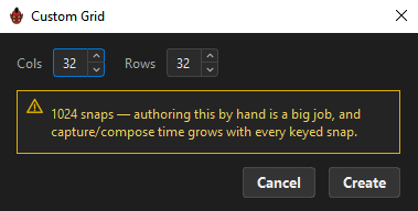
Custom… opens a dialog with Cols and Rows, each 2–32 — so 32 × 32 = 1024 poses, the same ceiling as a slider.
A live hint counts the snaps and escalates, but never blocks:
| Snaps | Message |
|---|---|
| ≤ 32 | N snaps |
| > 32 | "N snaps — that's a lot to pose/key per pair." |
| > 400 | "N snaps — authoring this by hand is a big job, and capture/compose time grows with every keyed snap." |
The dialog defines the logical shape only. Where the rows and columns physically sit is refined in the Widget Editor.
Reshaping a knob renumbers its consumers
If the layer is being used as a knob, changing its shape re-addresses every key its consumers hold so each authored position keeps its visual snap. ORC reports it: "Knob reshaped — 84 key(s) renumbered to the new grid."
Read-only snaps
Two cases where a snap is visible but not editable:
- The side columns of a back face using Share Sides. They render teal and stay clickable so you can jump to the frame the front authored, but editing them is refused — author them on the front.
Large grids
The grid is fixed-size: a big one scrolls rather than shrinking, which is why every row and column keeps its ruler label.
In the Navigator, density degrades gracefully instead: below about 16 px between dots only the active snap keeps its frame badge — drawn on a dark pill with a crosshair across the grid — and below about 7 px the dots shrink. On a slider, ticks stop being painted below about 3 px; navigate with the arrows and anchors.
Related
- Fill Grid & Fill Dimensions
- Grid Presets — saving a shape, spacing and frames
- Keying & Auto-Capture
- Pages, Pairs & Sides